If your webpage contains a form, it’s likely that your primary goal is getting users to fill it out. To make sure your form is the focal point of your page, use a container to highlight what’s inside. Encapsulating your form or call to action can be as simple as adding an outline or box around it. Avoid allowing form fields to float with the rest of your content and risking them getting lost with other page elements. By framing in your form, you can help constrain your users’ point of interest to your primary objective.
Forms
Add trust logos or badges
Trust logos or badges can help you add an element of trust to your website or landing page, boosting your overall conversion rate. If you’re a member of a business organization, were the recipient of an award, a stellar rating, or hold other accolades, show them off by including the logos or badges on your page. Examples include anything from Rotary membership badges or Better Business Bureau ratings to the logos of well known clients who have trusted your work. Try including them in close proximity to known anxiety-producing elements, such as lead forms or transactional buttons. By displaying trust badges, you can help reassure your users of your good reputation and that they won’t be cheated or scammed.
Avoid using CAPTCHA puzzles
CAPTCHA puzzles nearly always add friction and a level of frustration to the conversion process. Unless SPAM is such a problem that it is completely unmanageable, you should avoid using them. They certainly aren’t helping your conversion rates. If you must implement a CAPTCHA, take the time to choose the right one. Some CAPTCHA technologies have improved greatly in recent years, but others can be outright impossible to solve. Don’t build such a roadblock that you block qualified leads from completing your form.
Remove the “clear fields” button from your form
This one should be pretty obvious, but you still see a lot of forms out there with them. Offering your users an easy option to clear fields that they’ve already completed just doesn’t make a lot of sense when you’re trying to get people to complete the form fields. Stop making it easy for users to change their minds about whether or not to provide their information! Yes, there may be a case or two out there where someone might argue that providing this option helped them improve the quality of their leads or the accuracy of their database information because they were auto populating the fields, but in most cases it’s just plain not going to get you more lead conversions.
Automatically populate form fields you’ve already collected
If you’re working on building a subscriber database, configure your lead forms to auto populate fields for which you already have the user’s information on file. Or, better yet, hide these fields altogether. Don’t make your users fill out their information again unnecessarily. Instead, ask only for enough information to accurately identify them with the database. By doing so you can greatly reduce the length of your form and in turn reduce friction and encourage engagement.
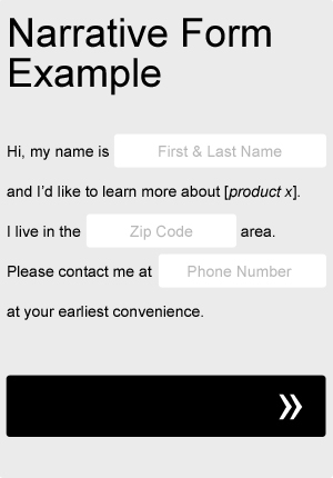
Try a narrative or “Mad Libs” approach to your form
Sometimes taking a Mad Libs approach to your form can actually help your completion rate. Try adapting your current form fields to fit a more narrative format, as in the very basic example below. Not only will it add a little bit of fun and creativity to your form, but you can even use it to help guide your users through the process. Be sure to A/B test it against your old, standard form.
Left align your form fields
One of the most important things to consider when designing forms is it’s scanability. Before making the decision to even begin filling out a form, most users will quickly scan the form, taking a quick mental inventory of what will be required of them. If the user feels that the form is too long or too complicated to be worth their time and effort, they may likely decide not to complete it. When choosing how to align your form’s input fields and their labels, there are a number of variations you can use, but left alignments in general tend to aid scanability slightly more than others. Left alignments create a natural flow of information from top to bottom and ease scanability. Avoid right aligning field labels against their input fields, creating a ragged left edge and making more work for the eyes. Instead, try your labels left aligned, next to their input fields. Try also testing a version where the labels are left aligned above their input fields.
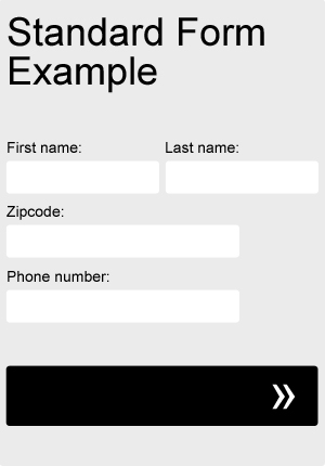
Try a single column form
One of the most important things to consider when designing forms is it’s scanability. Before making the decision to even begin filling out a form, most users will quickly scan the form, taking a quick mental inventory of what will be required of them. If the user feels that the form is too long or too complicated to be worth their time and effort, they may likely decide not to complete it at all. By vertically stacking your fields and sticking to a single column layout, your form fields will appear more organized and will be easily scanable from top to bottom.
There are a few related form fields, however, that are much more acceptable to list side by side. To make your form seem slightly shorter, try listing closely grouped items, such as first and last name, city and state, and dates next to each other horizontally.
Let your users know what to expect next
Leave out the guesswork. Set expectations. Being vague won’t get people to click on your button or call to action. People like to be in control. Don’t leave them guessing what the next step will be. Show your users where they stand in lengthy processes. Incorporate progress bars. Be clear about what will happen once they complete a lead form or place an order. Clicking submit without knowing exactly what to expect next creates uncertainty. Uncertainty creates friction—and friction can kill the success rate of your page.