As the saying goes, “a picture is worth a thousand words”. And it couldn’t be more true for anyone selling products online. Online merchants are often challenged by a consumer’s inability to physically handle the product—to touch, to feel, to turn the product around and look it over in person—before deciding to make a purchase. It’s one advantage traditional brick and mortar establishments continue to hold over e-commerce. To help close the gap, be sure to use product images that show the product in its best light and that highlight its best features. Use only professional, high quality images. Make them big, make them zoom-able and show the details. Offer views from different angles and show any alternative variations. It can also help to show the product in context to demonstrate size, how it’s used, or to help your customers imagining themselves using it.
Create a sense of urgency
People often think too hard, wait too long, procrastinate, or simply don’t respond when presented with a call to action. As a result, many of these potential leads or customers don’t end up converting at all. By creating a sense of urgency, you can persuade your users to react more quickly, reducing some of the mental friction created by offering too much time to make a decision. Experiment with incorporating techniques such as scarcity, countdowns or loss-aversion into your sales copy to improve conversion rates.
Encapsulate your form or call to action
If your webpage contains a form, it’s likely that your primary goal is getting users to fill it out. To make sure your form is the focal point of your page, use a container to highlight what’s inside. Encapsulating your form or call to action can be as simple as adding an outline or box around it. Avoid allowing form fields to float with the rest of your content and risking them getting lost with other page elements. By framing in your form, you can help constrain your users’ point of interest to your primary objective.
Ask people to share, like or rate your content
If you want more people to like your posts, share your content, or rate your product, just ask. Direct calls to action for social engagement can often be the nudge your audience needs to react the way you want them to. It’s not uncommon for studies to show triple digit percentage increases in engagement when users are simply asked to like, share or follow a page. A call to action is one of the most important pieces to your marketing campaign and including one in your social strategy should be no exception.
Personalize your content
Nurture your users by personalizing the content they see. If you have it, pull information such as name, location, referral source, etc. from your database or link appends, and dynamically insert it into your page or email copy. For example, let’s imagine we have a job board with a headline that reads, “Companies are hiring people like you:”. If we know where they’re searching, we can personalize the headline with dynamic fields. It then becomes, “Companies in Cleveland are hiring people like you”. This adds to the user experience by speaking more specifically to each user’s needs. Of course, you might not always have the information to dynamically insert for every user, so always be sure to set a default entry, such as “in your area”, or word the content in a way so that the dynamic fields can simply be left out, as we did in the example above.
Add trust logos or badges
Trust logos or badges can help you add an element of trust to your website or landing page, boosting your overall conversion rate. If you’re a member of a business organization, were the recipient of an award, a stellar rating, or hold other accolades, show them off by including the logos or badges on your page. Examples include anything from Rotary membership badges or Better Business Bureau ratings to the logos of well known clients who have trusted your work. Try including them in close proximity to known anxiety-producing elements, such as lead forms or transactional buttons. By displaying trust badges, you can help reassure your users of your good reputation and that they won’t be cheated or scammed.
Avoid using CAPTCHA puzzles
CAPTCHA puzzles nearly always add friction and a level of frustration to the conversion process. Unless SPAM is such a problem that it is completely unmanageable, you should avoid using them. They certainly aren’t helping your conversion rates. If you must implement a CAPTCHA, take the time to choose the right one. Some CAPTCHA technologies have improved greatly in recent years, but others can be outright impossible to solve. Don’t build such a roadblock that you block qualified leads from completing your form.
Remove the “clear fields” button from your form
This one should be pretty obvious, but you still see a lot of forms out there with them. Offering your users an easy option to clear fields that they’ve already completed just doesn’t make a lot of sense when you’re trying to get people to complete the form fields. Stop making it easy for users to change their minds about whether or not to provide their information! Yes, there may be a case or two out there where someone might argue that providing this option helped them improve the quality of their leads or the accuracy of their database information because they were auto populating the fields, but in most cases it’s just plain not going to get you more lead conversions.
Automatically populate form fields you’ve already collected
If you’re working on building a subscriber database, configure your lead forms to auto populate fields for which you already have the user’s information on file. Or, better yet, hide these fields altogether. Don’t make your users fill out their information again unnecessarily. Instead, ask only for enough information to accurately identify them with the database. By doing so you can greatly reduce the length of your form and in turn reduce friction and encourage engagement.
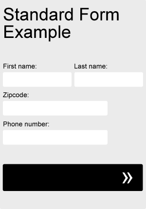
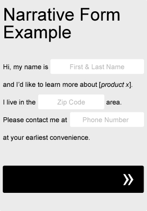
Try a narrative or “Mad Libs” approach to your form
Sometimes taking a Mad Libs approach to your form can actually help your completion rate. Try adapting your current form fields to fit a more narrative format, as in the very basic example below. Not only will it add a little bit of fun and creativity to your form, but you can even use it to help guide your users through the process. Be sure to A/B test it against your old, standard form.
- 1
- 2
- 3
- …
- 5
- Next Page »