Nurture your users by personalizing the content they see. If you have it, pull information such as name, location, referral source, etc. from your database or link appends, and dynamically insert it into your page or email copy. For example, let’s imagine we have a job board with a headline that reads, “Companies are hiring people like you:”. If we know where they’re searching, we can personalize the headline with dynamic fields. It then becomes, “Companies in Cleveland are hiring people like you”. This adds to the user experience by speaking more specifically to each user’s needs. Of course, you might not always have the information to dynamically insert for every user, so always be sure to set a default entry, such as “in your area”, or word the content in a way so that the dynamic fields can simply be left out, as we did in the example above.
Remove the “clear fields” button from your form
This one should be pretty obvious, but you still see a lot of forms out there with them. Offering your users an easy option to clear fields that they’ve already completed just doesn’t make a lot of sense when you’re trying to get people to complete the form fields. Stop making it easy for users to change their minds about whether or not to provide their information! Yes, there may be a case or two out there where someone might argue that providing this option helped them improve the quality of their leads or the accuracy of their database information because they were auto populating the fields, but in most cases it’s just plain not going to get you more lead conversions.
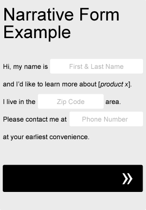
Try a narrative or “Mad Libs” approach to your form
Sometimes taking a Mad Libs approach to your form can actually help your completion rate. Try adapting your current form fields to fit a more narrative format, as in the very basic example below. Not only will it add a little bit of fun and creativity to your form, but you can even use it to help guide your users through the process. Be sure to A/B test it against your old, standard form.
Let your users know what to expect next
Leave out the guesswork. Set expectations. Being vague won’t get people to click on your button or call to action. People like to be in control. Don’t leave them guessing what the next step will be. Show your users where they stand in lengthy processes. Incorporate progress bars. Be clear about what will happen once they complete a lead form or place an order. Clicking submit without knowing exactly what to expect next creates uncertainty. Uncertainty creates friction—and friction can kill the success rate of your page.
Add an actionable icon like an arrow to your primary button.
Experiment with adding some strategic iconography to your primary button. Choose actionable icons, such as forward-facing arrows, that suggest to the user that something expected is about to happen next as a result of clicking on it. For downloads, you might test out a down-facing arrow or even file type icons, such as the Adobe pdf icon. Actionable icons can reinforce anticipation, or even set expectations and can help persuade your visitors to take the next step.
Give users enough time and information to make a decision
The more complex the product or service, the more time it may take your customers to make a commitment. What are the risks associated with making the wrong decision?— Is the product expensive? Does it require a significant time commitment? Could it pose a health risk? Put yourself in your users’ shoes. How much information would you require in order to make an informed decision? The more risk associated with potentially making a wrong decision, the more research we typically seek out as part of our decision-making process. Experiment with things such as copy length, filtered content and comparison charts. Don’t be too aggressive up front and make sure you’re providing your user’s with the right amount of information.
Focus on a single call to action
Multiple offers confuse the user and confused users means lower conversions. Determine which single call to action is most important and make it the focus of your page. Make all other options clearly secondary. Create an obvious hierarchy. All links are not equally important. Attempts to be all-inclusive can create leaks in your sales funnel by distracting users ready to commit with unnecessary information.
Simplify!
Take an inventory of your website, landing page or email template and remove anything that isn’t absolutely necessary. Look at design elements, copy, form fields, and anything that isn’t needed to get your point across. Resist the urge to include every last detail. Excess information can clog up your conversion path — especially late in the buying cycle. Simplify until there’s nothing left to remove. Be direct and to-the-point. Avoid fluff copy, big words and fancy verbiage. Sum things up. Figure out which aspects are the most important to your conversion funnel and make them a priority. Follow Pareto’s law of the vital few: What 20% of your page is contributing to 80% of your goals?
Address fears, doubts and uncertainties
Find out what fears, doubts and uncertainties your users have and address them. Consider what you’re asking of your users. What risks do your customers face by interacting with or making a purchase from your site? Does the reward outweigh the risks? Depending on your scenario, it could be as simple as adding things like an SSL security certificate, trust emblems, testimonials, or offering some kind of guarantee. You may also consider addressing any specific concerns directly through strategic page copy. If you need more insight into your users’ thought processes, there are a number of tools and usability testing software and services available, such as UserTesting.com, which offers some quick, free user testing services.