Try a narrative or “Mad Libs” approach to your form

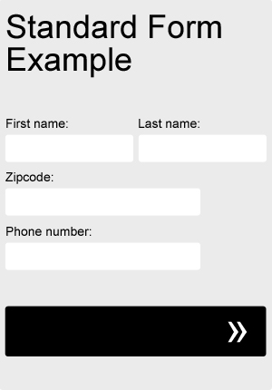
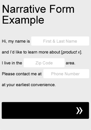
Sometimes taking a Mad Libs approach to your form can actually help your completion rate. Try adapting your current form fields to fit a more narrative format, as in the very basic example below. Not only will it add a little bit of fun and creativity to your form, but you can even use it to help guide your users through the process. Be sure to A/B test it against your old, standard form.

standard form

mad libs form

Left align your form fields

One of the most important things to consider when designing forms is it’s scanability. Before making the decision to even begin filling out a form, most users will quickly scan the form, taking a quick mental inventory of what will be required of them. If the user feels that the form is too long or too complicated to be worth their time and effort, they may likely decide not to complete it. When choosing how to align your form’s input fields and their labels, there are a number of variations you can use, but left alignments in general tend to aid scanability slightly more than others. Left alignments create a natural flow of information from top to bottom and ease scanability. Avoid right aligning field labels against their input fields, creating a ragged left edge and making more work for the eyes. Instead, try your labels left aligned, next to their input fields. Try also testing a version where the labels are left aligned above their input fields.

Communicate form validation errors clearly

If you’re using any kind of form validation on your site, be sure to communicate input errors clearly. Let your users know why the form wasn’t submitted successfully. Rather than vague “All fields are required” error messaging, tell your users specifically what they missed or why their input wasn’t accepted. Did their phone number not have enough numbers? Were they missing the “.com” from their email address? Give clear instructions as to how to fix the problem and successfully resubmit their information.

Simplify the process

Don’t make processes any more complicated than they need to be. Remove all unnecessary options. Make it intuitive. Shorten the distance from point A to point B. Don’t make your users do any more work or thinking than they have to. The less options, the better. Whether it’s implementing a sticky menu to prevent unnecessary scrolling or adjusting the steps in a lengthy application process, the simpler things are, the less chance your users will become frustrated and leave.