If your webpage contains a form, it’s likely that your primary goal is getting users to fill it out. To make sure your form is the focal point of your page, use a container to highlight what’s inside. Encapsulating your form or call to action can be as simple as adding an outline or box around it. Avoid allowing form fields to float with the rest of your content and risking them getting lost with other page elements. By framing in your form, you can help constrain your users’ point of interest to your primary objective.
Avoid using CAPTCHA puzzles
CAPTCHA puzzles nearly always add friction and a level of frustration to the conversion process. Unless SPAM is such a problem that it is completely unmanageable, you should avoid using them. They certainly aren’t helping your conversion rates. If you must implement a CAPTCHA, take the time to choose the right one. Some CAPTCHA technologies have improved greatly in recent years, but others can be outright impossible to solve. Don’t build such a roadblock that you block qualified leads from completing your form.
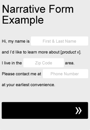
Try a narrative or “Mad Libs” approach to your form
Sometimes taking a Mad Libs approach to your form can actually help your completion rate. Try adapting your current form fields to fit a more narrative format, as in the very basic example below. Not only will it add a little bit of fun and creativity to your form, but you can even use it to help guide your users through the process. Be sure to A/B test it against your old, standard form.
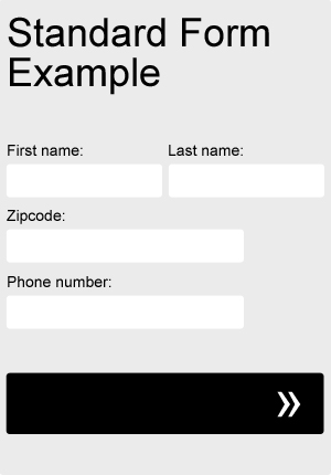
Try a single column form
One of the most important things to consider when designing forms is it’s scanability. Before making the decision to even begin filling out a form, most users will quickly scan the form, taking a quick mental inventory of what will be required of them. If the user feels that the form is too long or too complicated to be worth their time and effort, they may likely decide not to complete it at all. By vertically stacking your fields and sticking to a single column layout, your form fields will appear more organized and will be easily scanable from top to bottom.
There are a few related form fields, however, that are much more acceptable to list side by side. To make your form seem slightly shorter, try listing closely grouped items, such as first and last name, city and state, and dates next to each other horizontally.
Mention your privacy policy near the form or submit button
One of the top reasons users don’t fill out lead forms is the uncertainty of what might be done with their information. Set expectations. Provide a link to your privacy policy under or near your form that ensures their personal information will be safe and won’t be sold or distributed to third parties. If you don’t have an official privacy policy, try implementing a short line of copy that reassures users their contact information won’t be abused.
Align what you’re requesting of the user with the benefit being offered
Whether you’re utilizing some kind of link bait to drive email signups or campaigning for large scale initiatives, always make sure that what you’re requesting of the user aligns with the benefit being offered. As an extreme example, requiring users’ Social Security numbers might be completely acceptable for a college application. The benefit of obtaining a college degree outweighs any risk of providing personally identifiable information. On the other hand, if you were to require Social Security numbers in return for a flimsy pdf download, then you’d likely have a lot of trouble obtaining leads! But, it may not always be this obvious. Even more common fields, such as a phone number or street address, could have the potential to negatively effect your form completion rates, depending on the benefit being offered. Take a look not only at your form fields, but at any hoops your users are being required to jump through in order to get to what they’re looking for.
Reduce the number of form fields
Filling out forms annoys almost everyone. And the longer the form, the more annoying they tend to be. There’s usually a direct correlation between form length and completion rates. In general, the longer the form, the less users will be motivated to fill it out. Take a good look at your form fields. How important is it that you collect all of the information that you’re asking for? Is each field so valuable that you’re willing to lose leads over it? Remove any fields that hold no or minimal value. Consider collecting secondary information in follow up emails or phone calls.
Use action verbs that convey value to your users
The implications behind certain action verbs can often affect users’ willingness to follow through. Pay special attention to what your buttons and calls to action might suggest. A phrase like “order now” could imply to some users that they will have to wait to get whatever it is that they’re looking for. Others, like “apply now” or “join now”, could suggest that something might be required of the user in order to be a part of whatever the group is that they’re joining. Rather than focusing on what the group’s requirements are of the user to join, focus on what the user requires of the group. How will they benefit? Try using gain-focused words (ex: get, view, enjoy, discover, see, play) over effort-focused (ex: submit, start, activate, learn, pay, go). If the user is interested in a free download that you’re offering in return for them joining your email list, instead of “Join now” (what you want them to do), maybe your button reads “Get my free download”.
Use positive reinforcement in your calls to action or button text
It rarely ever hurts to remind your users what’s in it for them. Form buttons are often the tipping point between your customers deciding to follow through with the process or turning around and bouncing. Your button text should positively reinforce the user’s behavior of completing the form by reminding them, “If you do action (A), you’ll get (B) in return”. Try using specific language in your button copy that reiterates whatever it is they are expecting in return. Example: “Get (B) now”.
Stop using the word “submit” on your form submission buttons
It used to be that the word “submit” on a form submission button described what the system did when it was clicked. Now, with the tendency toward a more user-centered approach to website design, users have come to expect everything to be much more about them– and less about the technology.
Filling out a form is already one of those things that produces at least a little bit of anxiety in most users. It’s not something we ever really enjoy doing. Do you think the negative connotation behind the word “submit” helps relieve someone who’s already concerned about where their personal information is about to end up? It’s likely that it’s only reinforcing every worry about identity fraud that’s ever crossed their mind. Try using different language on your submission buttons that implies positive results. How are your users expecting to benefit from completing the form?